水平布局
inline-block + text-align

table + margin

absoulte + transform

flex + justify-content/margin

垂直居中
table-cell + vertical-align

absoulte + transform

flex + align-items

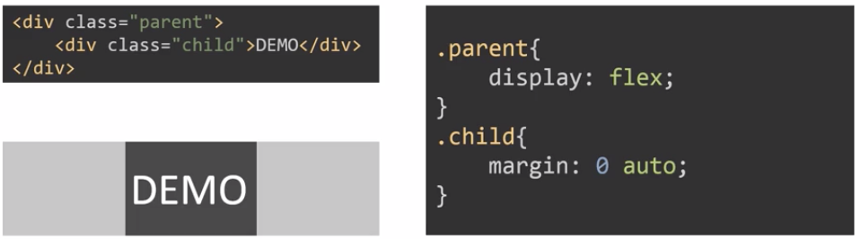
居中(水平垂直居中)
inline-block + text-align + table-cell + vertical-align

absoulte + transform

flex + justify-content + align-items

多列布局
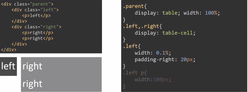
定宽 + 自适应
float + margin

float + overflow

table

flex

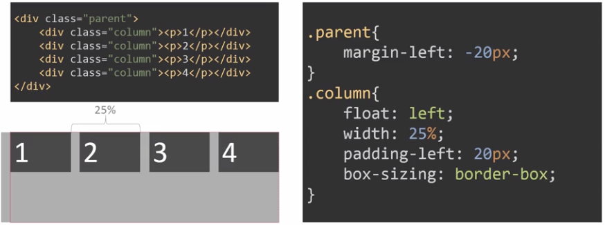
多列定宽 + 自适应
- 与定宽 + 自适应的布局方式一样,例如使用 float + overflow:

不定宽 + 自适应
不定宽的部分,宽带由内容来决定
float + overflow

table
flex

多列不定宽 + 自适应
与不定宽 + 自适应一样
等宽
float
table

flex

等高
table

flex

float
